
Every year, Pantone captures the design world’s attention with its Colour of the Year announcement. For 2026, Pantone has chosen Mocha Mousse — a warm, comforting neutral with rich undertones and a timeless elegance. If you’re curious about what makes this shade special, how it can be used, and why it feels particularly meaningful right now, this guide walks you through my honest and creative take on it.
What Is Mocha Mousse?
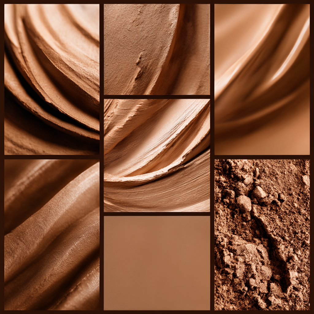
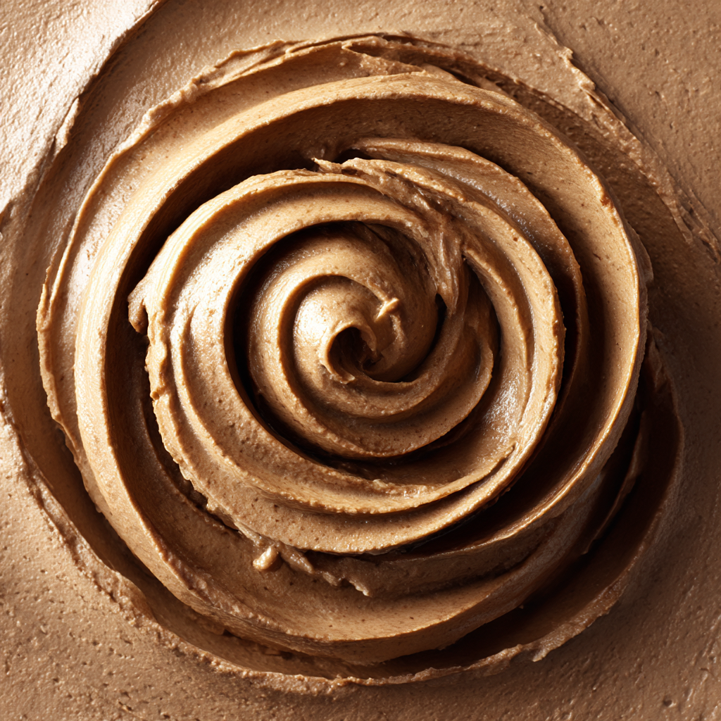
Mocha Mousse is more than just a brown tone. It’s a sophisticated neutral with warm cocoa undertones and a hint of creamy softness. Unlike deep espresso or sandy beige, Mocha Mousse sits somewhere in between: bold enough to make a statement, yet gentle enough to act as a versatile backdrop.
It’s earthy without feeling heavy, cozy without feeling dull — a colour that feels rooted in comfort and equilibrium.
Why Pantone Picked Mocha Mousse
Pantone’s Colour of the Year selections are never random. They reflect cultural conversations, emotional needs, and evolving design trends. In recent years, the world has shifted dramatically — socially, digitally, and emotionally. With that context in mind, Mocha Mousse feels like a response to collective needs for calm, grounding, and warmth.
Where past years have seen vibrant, energetic hues or stark, minimalist tones, Mocha Mousse lands in a calming place. It’s a colour that says:
- Let’s slow down.
- Let’s feel grounded.
- Let’s create spaces that comfort us.
In an age of constant stimulation — social media feeds, endless screens, busy schedules — a shade that encourages rest and presence feels like more than a décor choice; it feels like an invitation.
Emotional Vibes: Comfort Meets Confidence
Mocha Mousse carries an emotional weight that isn’t just aesthetic. It bridges comfort and confidence in a way that resonates deeply with how many people want to feel in their environments.
It’s:
- Reassuring — like a warm blanket or a cozy corner with soft lighting.
- Stable — a shade that doesn’t overpower, but holds its own.
- Timeless — adaptable across trends and seasons.
Unlike brighter colours that shout for attention or stark whites that can feel sterile, Mocha Mousse whispers. It invites you to relax, to stay awhile, to enjoy your space rather than constantly rearranging it.
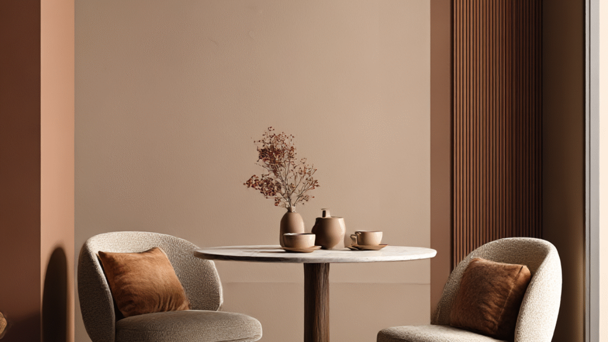
How Mocha Mousse Works in Interiors
The beauty of Mocha Mousse lies in its flexibility.
1. As a Wall Colour
Painting walls in Mocha Mousse sets a warm, welcoming foundation. It works beautifully in living spaces, bedrooms, and even kitchens where you want both softness and sophistication.
Paired with:
- Creamy whites → for crisp, light-filled spaces
- Deep olives or muted greens → for earthy, grounded palettes
- Soft terracottas → for a warm, cozy aesthetic
- Charcoal or black accents → for modern contrast
Mocha Mousse can shift its personality based on what it’s surrounded by.
2. With Furniture and Textiles
Because it’s a neutral, Mocha Mousse pairs beautifully with natural materials:
- Leather couches
- Wool throws
- Linen curtains
- Wood finishes
This expands its use beyond paint — into textiles, upholstery, rugs, and accent pieces.
3. In Lighting and Decor
Soft metallics like brushed brass or aged bronze bring out Mocha Mousse’s warmth. Meanwhile, matte ceramics and woven baskets deepen its organic feel. Whether your style is modern boho, classic minimalist, or cozy cottagecore, Mocha Mousse adapts without losing its soul.
Why Mocha Mousse Feels Right in 2026
We’re at a moment where design isn’t just about aesthetics — it’s about mental rhythm and lived experience.
More people are:
- Working from home
- Creating multifunctional spaces
- Seeking comfort without sacrificing style
- Rejecting harsh minimalism for approachable design
Mocha Mousse speaks to all of these trends. It’s practical without being dull, sophisticated without being cold, and adaptable without being indecisive.
In a world where everything feels fast and ever-changing, Mocha Mousse offers stillness. Not stagnation — but grounding.
Tips for Using Mocha Mousse in Your Space
If you’re inspired to bring Mocha Mousse into your home, here are some easy ways to start:
Start Small
- Try accent walls
- Add throw pillows or blankets in the shade
- Choose ceramics or frames with mocha undertones
Layer Textures
Because Mocha Mousse is subtle, texture is key. Think:
- Knitted fabrics
- Natural wood grains
- Linen and cotton layers
These add dimension and prevent the colour from feeling flat.
Balance Warmth and Light
In darker rooms, pair Mocha Mousse with light-reflecting surfaces (mirrors, glossy ceramics) to keep spaces bright. In sunlit rooms, let Mocha Mousse become the warm anchor that grounds the light.
Final Thoughts
Pantone’s 2026 Colour of the Year, Mocha Mousse, isn’t just a shade — it’s a mood, a mood shift, and a design philosophy. Its rich neutrality, emotional resonance, and flexible personality make it one of the most human-centred colours in recent years.
Whether you’re updating your walls, selecting furniture, or refreshing your décor, Mocha Mousse invites you to create spaces that feel thoughtful, warm, and genuinely yours.
In the end, great design doesn’t just look good it feels right. And Mocha Mousse feels like comfort, clarity, and calm in a world that needs all three.
Add a Comment